RELAY² / BRAND SYSTEM / 01BUILT TO
BUILT TO
BE SHARED.
Our name. Our colors. Our point of view.
Everything that makes Relay² feel like Relay².
01 / IDENTITYA SMALL NAME.
A SMALL NAME.
A BIG SIGNAL.
One place to manage the links you share and understand what gets clicked. For every recommendation—not just something for sale.
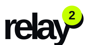

Keep at least one badge diameter clear around the wordmark.
Lowercase relay. A prominent lime badge. Never stretch or rearrange.
No outlines, extra effects, or substitute symbols. Write Relay² in copy.
02 / COLORELECTRIC.
ELECTRIC.
NOT CHAOTIC.
One dominant color. Space to breathe. A sharp accent when it matters. Select a swatch to copy its exact value.
Exact colors. Consistent everywhere.
PRODUCT COMPANION / CARBONDark. Never navy.
Page #080909 · Panel #121414 · Text #F4F6F4
Keep dark surfaces neutral and let the accents do the work.
03 / TYPOGRAPHYSAY LESS.
SAY LESS.
SAY IT BIG.
Arial and Helvetica Neue. Familiar letters with an unmistakable scale. Geist Mono brings structure to the small details.
DISPLAY / BOLD / TIGHTPASTE IT.
TRACK IT.
SHARE IT. ↗
TRACK IT.
SHARE IT. ↗
Your next recommendation starts with a link.
Aa Bb Cc 0123456789Short, uppercase, heavy. Tight tracking on display text only.
Sentence case. Comfortable spacing. No squeezed paragraphs.
Monospace eyebrows and section numbers. Never microscopic labels.
04 / ELEMENTSPERSONALITY.
PERSONALITY.
WITH PURPOSE.
Centered objects. Bold functional icons. A little angle and a hard shadow. Glass stays inside its own block.
READ IT.
A book worth recommending.
HEARD IT.
An episode worth sending.
WORE IT.
The outfit everyone asks about.
Use the supplied social-platform logos unchanged. Native emoji may vary across devices; use consistent artwork for final campaign assets.
05 / VOICEHUMAN.
HUMAN.
NOT HYPE.
Talk about what people actually share. Be direct about what Relay² does. Confidence comes from clarity, not bigger promises.
“See what
gets clicked.”
“The book. The episode. The outfit.”
“3 tracked links free.”
“Keep your links in one place.”
“Unlock your
influence.”
No vague transformation language.
No guaranteed earnings.
No invented performance numbers.
Make something unmistakably Relay².
Get the complete marketing guidelines and product style reference.